Fascinating Graphs
How do scientists know what is going on when the drill bit is some 300 meters below the seafloor, which is another 1 ½ miles below the ship? By graphs!
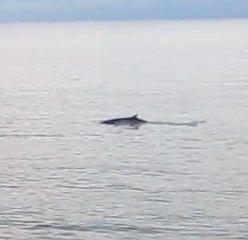
Certainly not by watching the whales that came by tonight as the Karaoke music was playing. One of my favorite early morning stops is the Operations Office. Here are a few examples of the graphs I like. (Nice colors!!)

See how the line variations on the third graph(depth) on the chart above, is fairly uniform and slanted to the right. The yellow line shows a progressive increase in the depth. If this line is smooth, drilling is progressing well. The spikes in the first graph, in this case, show changes in the rock resistance, (I believe), and are OK.

In this next graph, the change in the third graph over in the chart is when they had to lift up a little on the drill string to add another pipe length.

The graph above shows that the first graph on the chart, RPMs, is varying. This means that the bit is having difficulty keeping a constant turning speed for some reason so the progression downwards (third graph on the chart) is not progressing smoothly.